February 5th, 2022
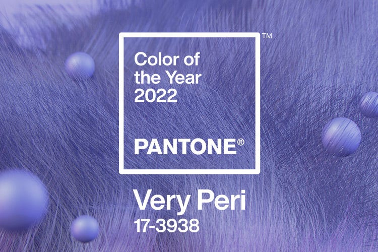
At the start of every new year, Pantone chooses a new color to represent the year ahead. This selected color predicts the upcoming trends of the year and gives us insight into what to expect from the color palettes of the new year. This year’s Pantone’s Color of the Year offers us more than simply new trend predictions: it offers us a glimmer of hope for the new year during especially challenging times.
2022’s Pantone Color of the Year is a joyful, dynamic shade of purple called Very Peri. This shade of periwinkle represents new hope and optimism for what’s ahead. In these uncertain times, we could certainly use more of that feeling of hope and light. As Pantone explains:
“Very Peri is a symbol of the global zeitgeist of the moment and the transition we are going through. Displaying a carefree confidence and a daring curiosity that animates our creative spirit, inquisitive and intriguing PANTONE 17-3938 Very Peri helps us to embrace this altered landscape of possibilities, opening us up to a new vision as we rewrite our lives. Rekindling gratitude for some of the qualities that blue represents complemented by a new perspective that resonates today. Very Peri places the future ahead in a new light.”
This color, soft and light, yet energizing and powerful, feels wonderfully appropriate and unforgettable. Whether intentional or not, this color also blends together our country’s two political colors, subtly hinting at the hope for unity that we so desperately need.
Inspired by this unique color choice, we’ve curated a few Gallery MAR artworks by our artists that captures the spirit and hope of this periwinkle hue. We hope these Gallery MAR works and their Very Peri color inspire you today.
Jylian Gustlin
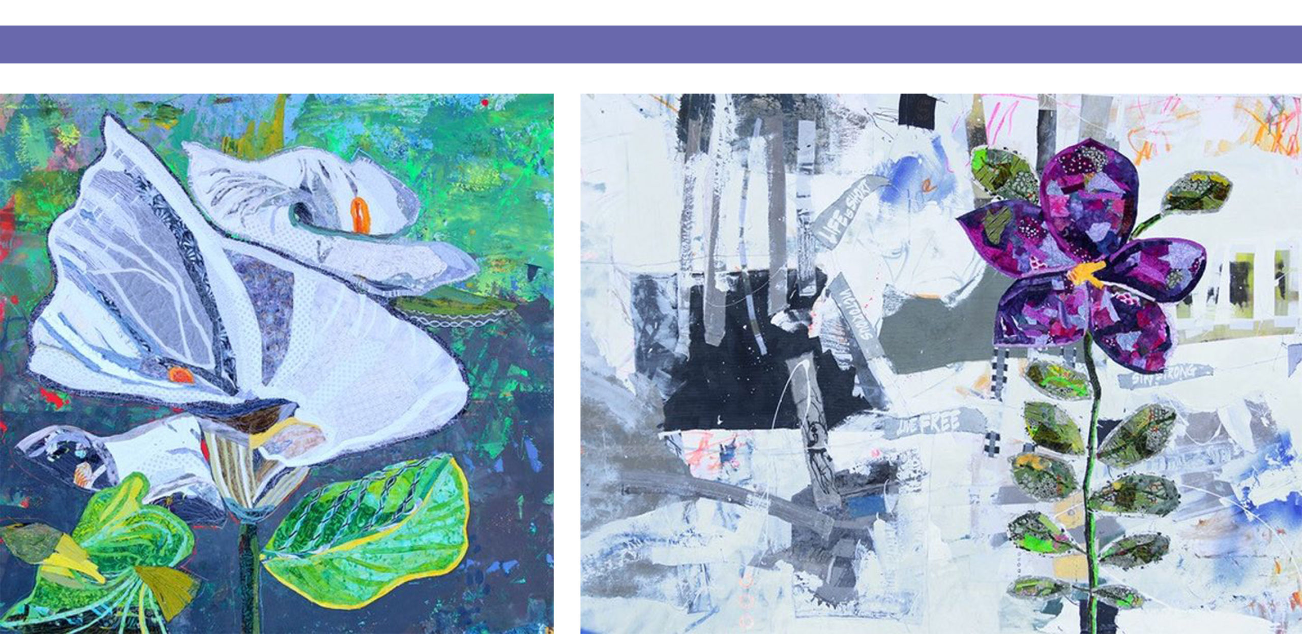
Jylian Gustlin, “Flora 15,” mixed media, 48″ x 48″ | Jylian Gustlin, “Flora 13,” mixed media, 54″ x 72″
Jylian Gustlin‘s floral work blooms with vibrant color and energetic texture. Gustlin applies her signature expressive brushstrokes and highly textured markings to her floral work, but with this new floral subject matter, her work is imbued with all of the freshness of spring. Combine the symbolism of freshly blooming flowers with her inclusion of periwinkle hues, and we are offered a work filled with hope for the future.
Glen Hawkins
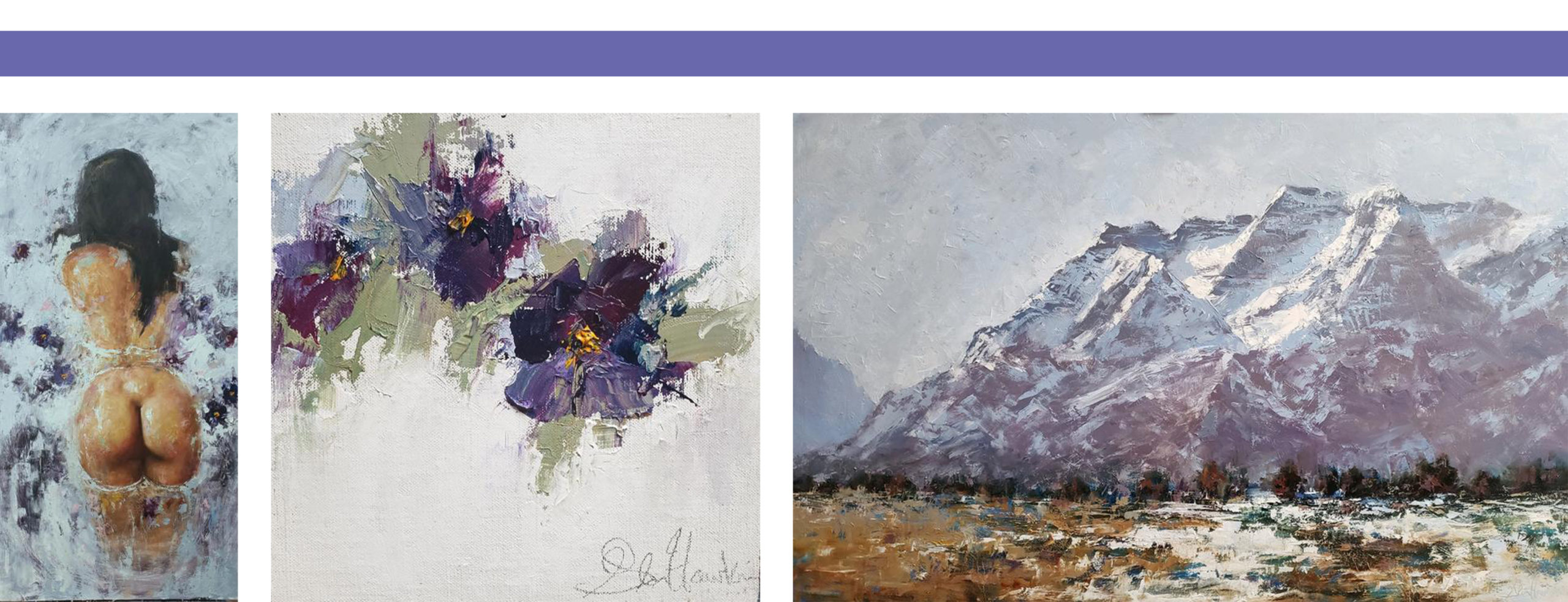
Glen Hawkins, “Bath Bomb & Petals,” oil, 48″ x 24″ | Glen Hawkins, “Pansies,” oil, 8″ x 8″ | Glen Hawkins, “Change of Seasons,” oil, 30″ x 48″
Glen Hawkins’ work embodies a feeling of quiet Romanticism, from luxurious flower petal bubble baths, to sweeping landscapes, to intimate scenes of flowers blooming. His implementation of rich shades of purple add to the feeling of peace and beauty found in his work. The rich, sophisticated hues that he applies heighten the drama and intrigue of these romantic scenes, highlighting natural beauties all around.
Michael Kessler
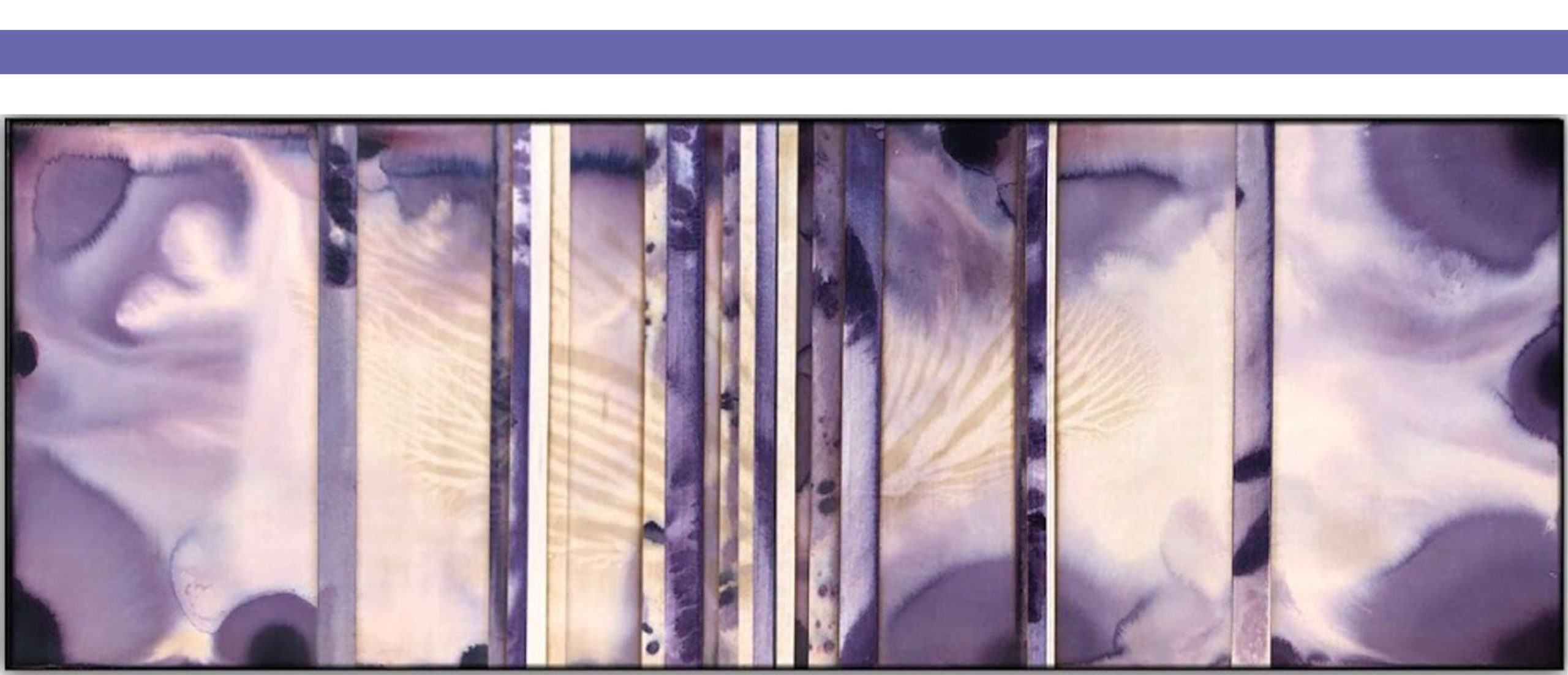
Michael Kessler, “Focusfields (9),” acrylic, 30″ x 84″
Michael Kessler considers color to be merely one of many complex and intriguing aspects of design. His works focus largely on textural elements, composition, scale, and more. However, when he does choose to use color outside of grayscale, it’s to masterful, dynamic effect. His work “Focusfields (9)” makes powerful use of purple color. The washes of periwinkle and purple hues envelop us in a sense of peace, encouraging us to fall into his large-scale work and lose ourselves in a sea of purple and resplendent textures.
Jane Maxwell
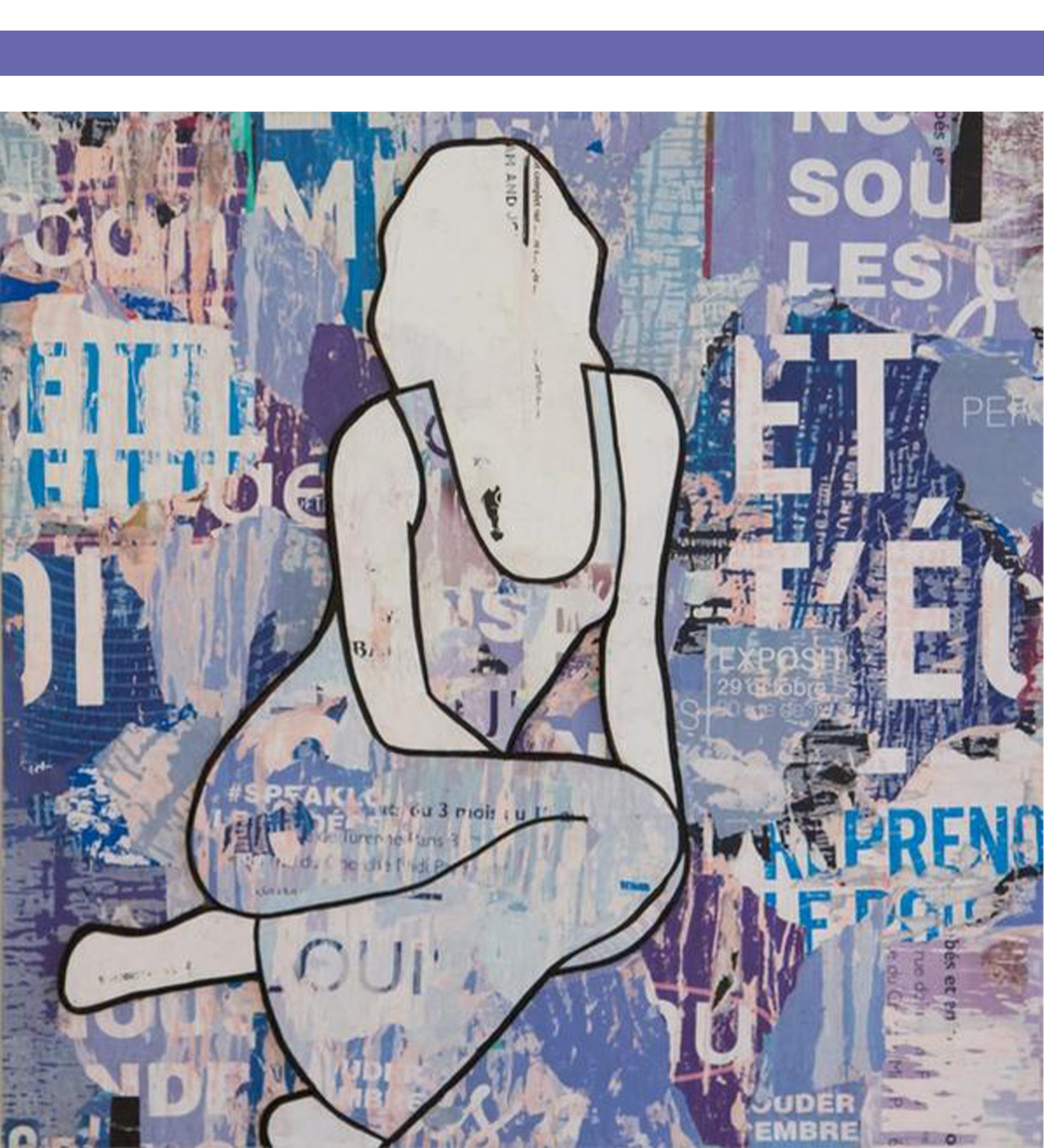
Jane Maxwell, “Purple Seated Girl,” mixed media, 36″ x 36″
Jane Maxwell’s mixed media works celebrate fashion and power. Her works demonstrate how one can be soft and feminine and simultaneously, strong, bold, and powerful. The purple periwinkle hues of her work “Purple Seated Girl” highlight this union, showing the feminine grace of her subject, while also imbibing the work with a boldness of color and texture.
Hunt Slonem
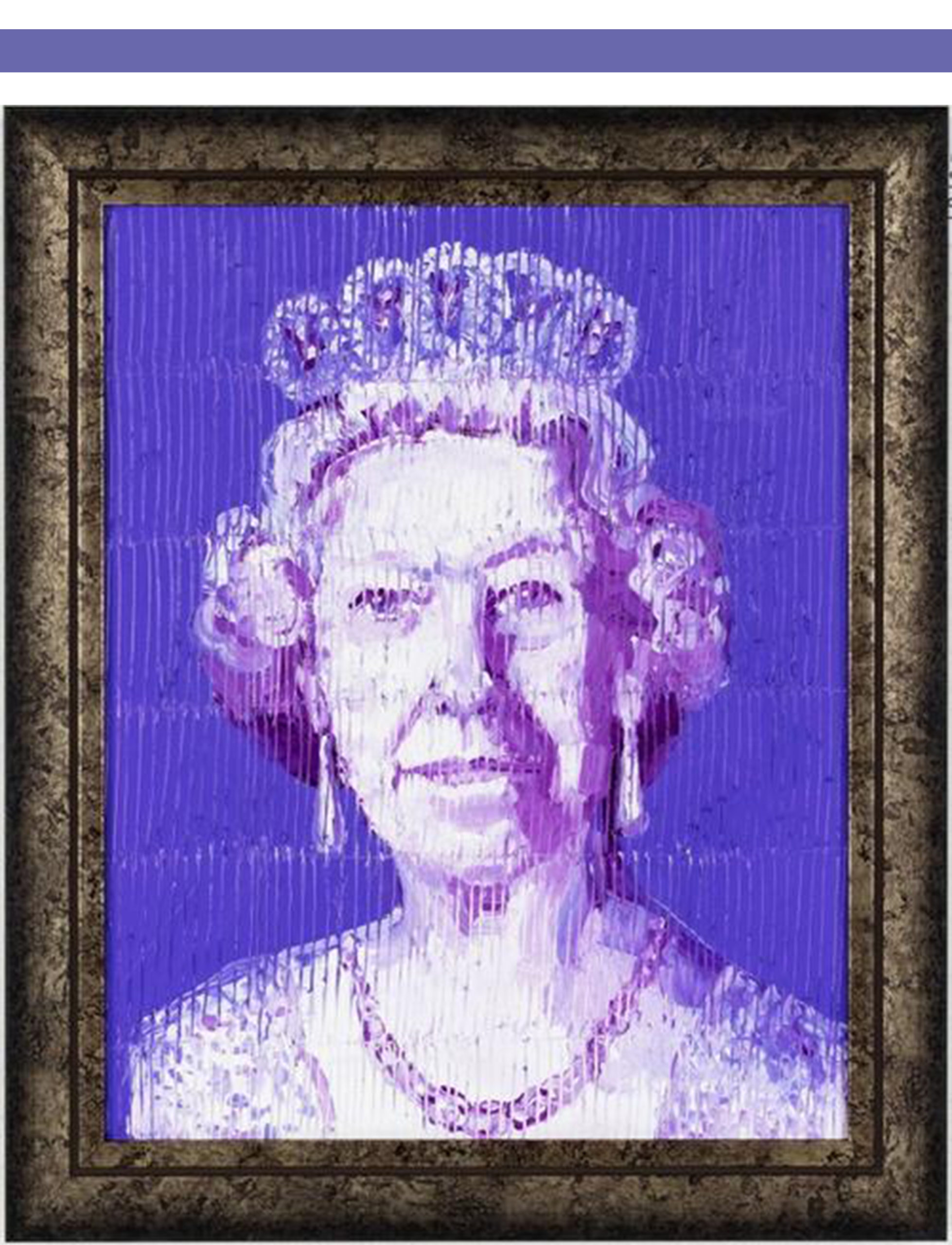
Hunt Slonem, “Her Majesty (Purple),” oil, 20″ x 16″
Hunt Slonem is known for his expressive strokes and vibrant colors. You would be hard-pressed to find a color that Hunt Slonem has not brilliantly displayed in one of his paintings. This periwinkle hue is no exception. His work, “Her Majesty (Purple)” shines in purple hues. These shades of purple enhance the feeling of royalty and majesty through their luminous, energizing color.
Havoc Hendricks
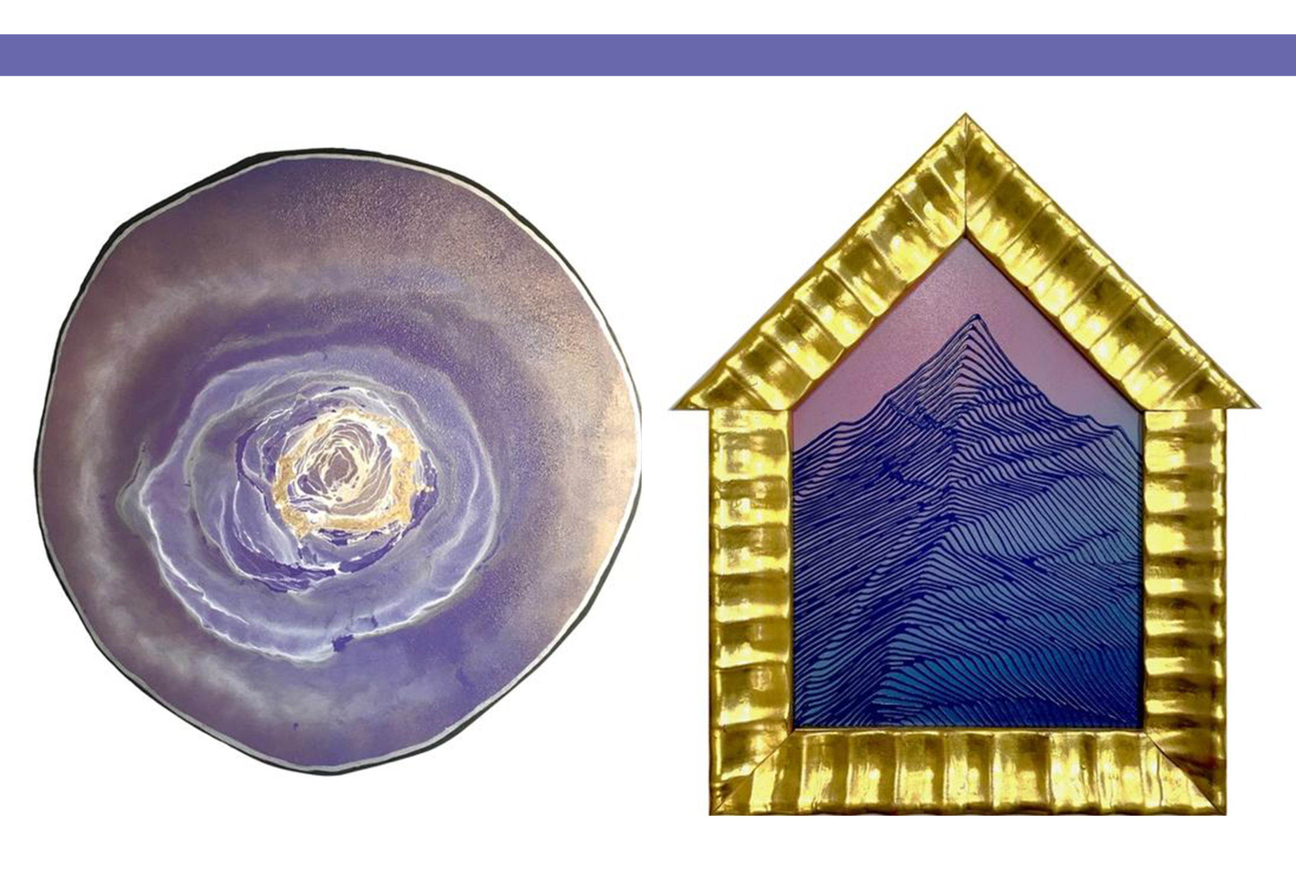
Havoc Hendricks, “Royal Geode,” mixed media, 23.5″ x 22.5″ | Havoc Hendricks, “Mountain Home,” mixed media, 24″ x 20″
Havoc Hendricks aims to present bold and surprising colors in his work. The intricate line work and textures of his mixed media pieces contain enough intrigue in themselves, but when paired with his unique color palettes, they feel all the more fresh and bold. The periwinkle purple hues in these works, “Royal Geode” and “Mountain Home” feel rich and unexpected, perfectly capture the “daring curiosity and creative spirit” of 2022’s Color of the Year, Very Peri.
Which of these “Very Peri” Gallery MAR works fills you with the greatest sense of peace and hope? What do you think of Pantone‘s 2022 Color of the Year? Send us a message or swing by the gallery to see these fresh works today.
 Fearless Painting Night at Gallery MAR for Marcella Deer Valley
 The Monk Series: Limited Edition Prints by Mary Scrimgeour
 Ballet West Summit, July 15-17, 2026